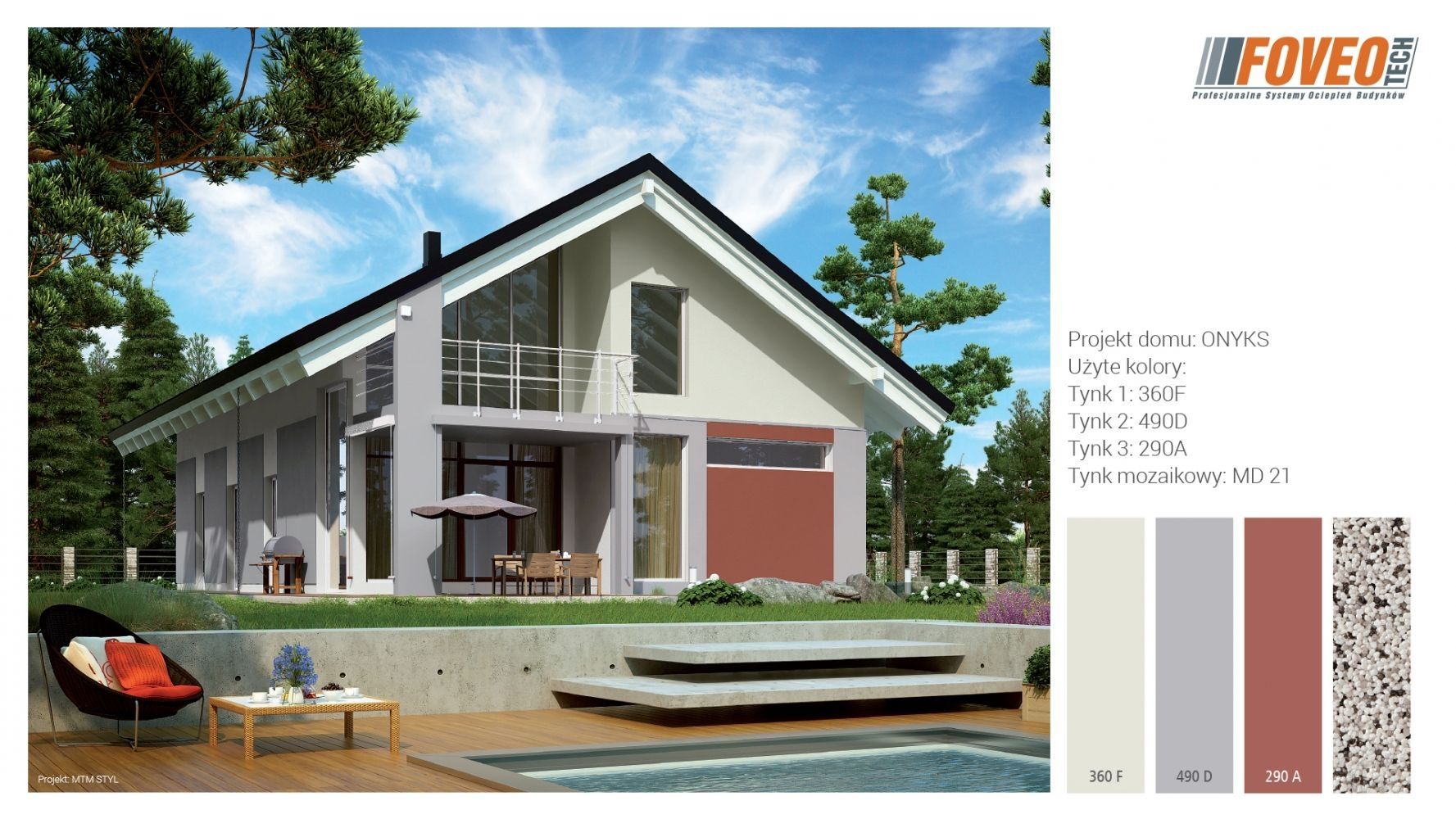
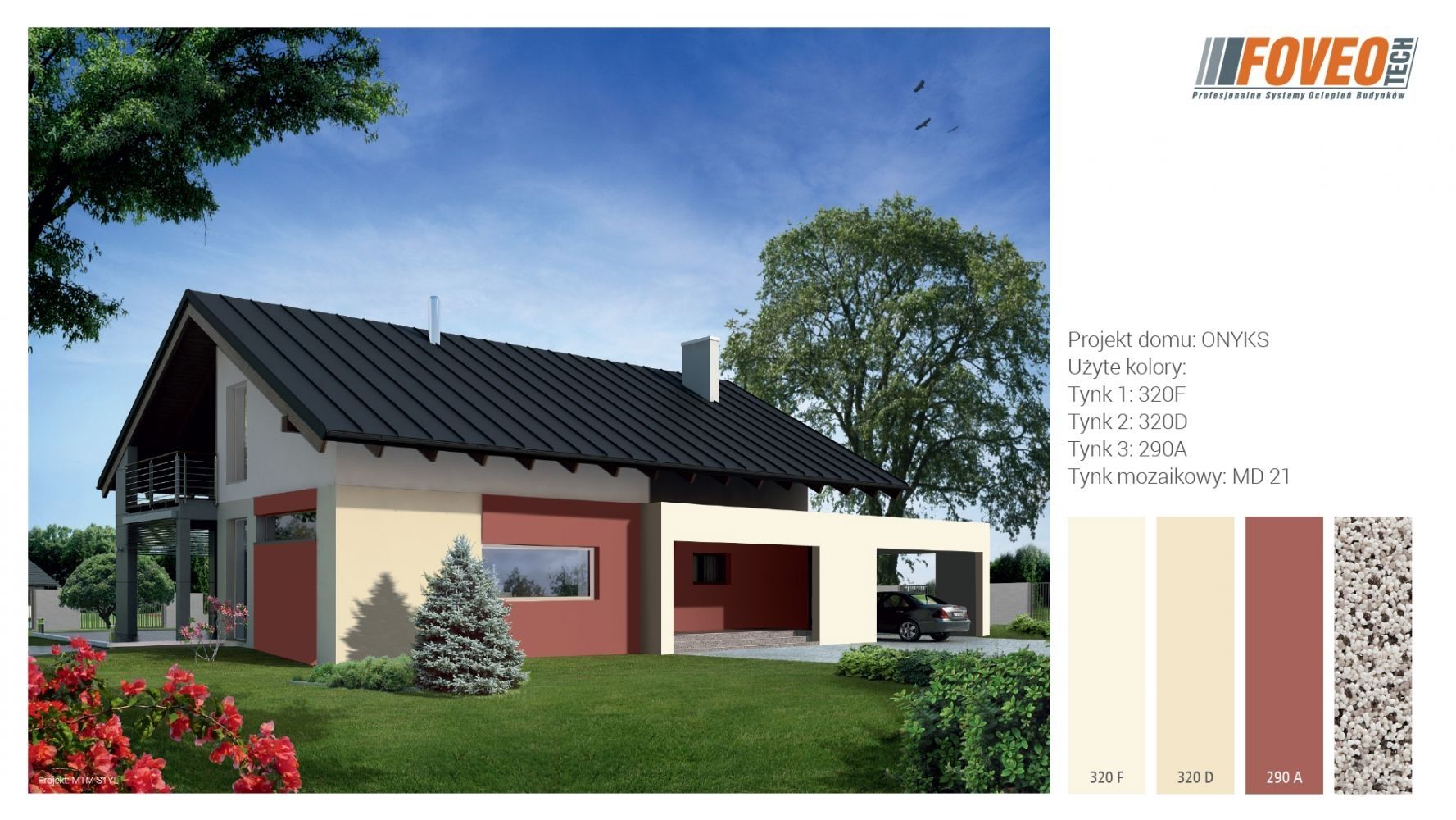
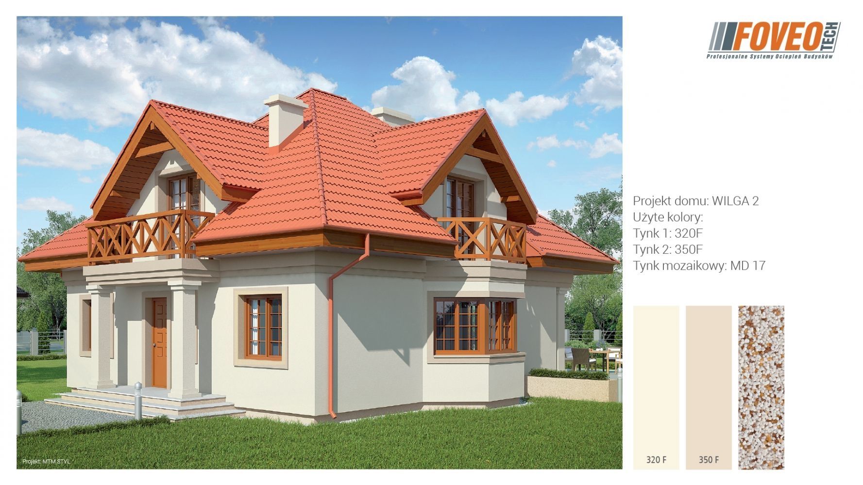
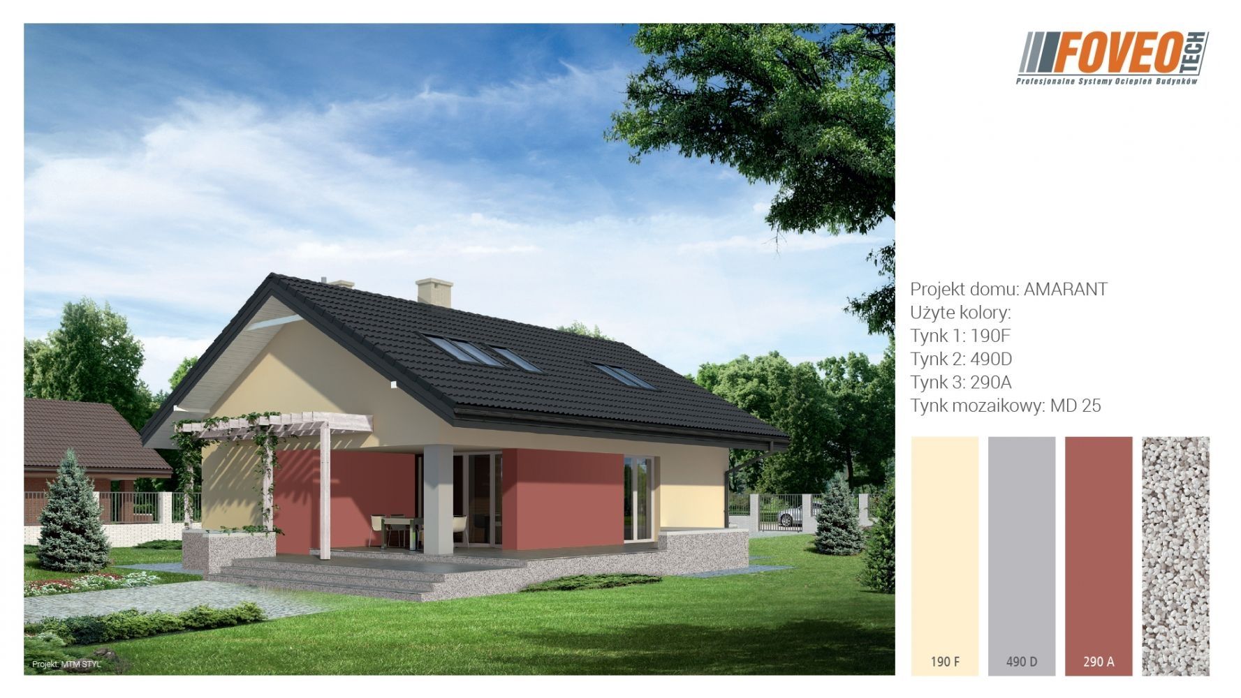
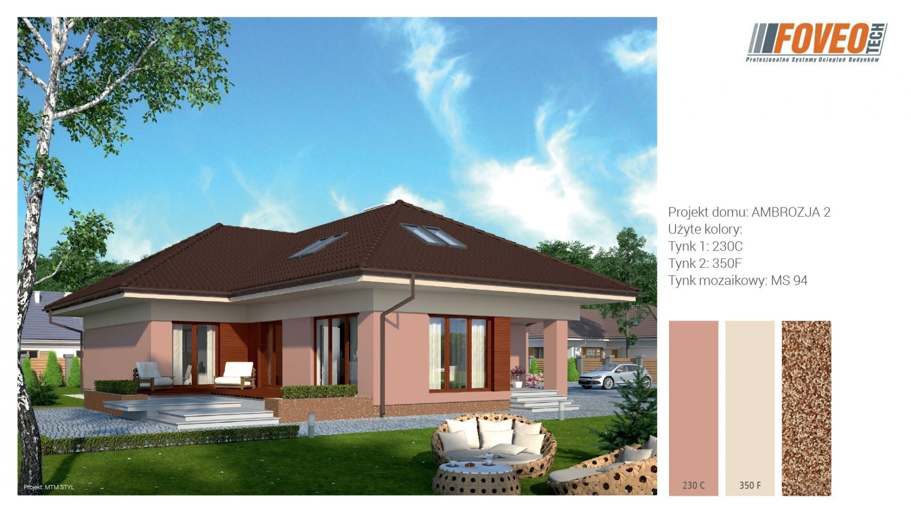
Red colour
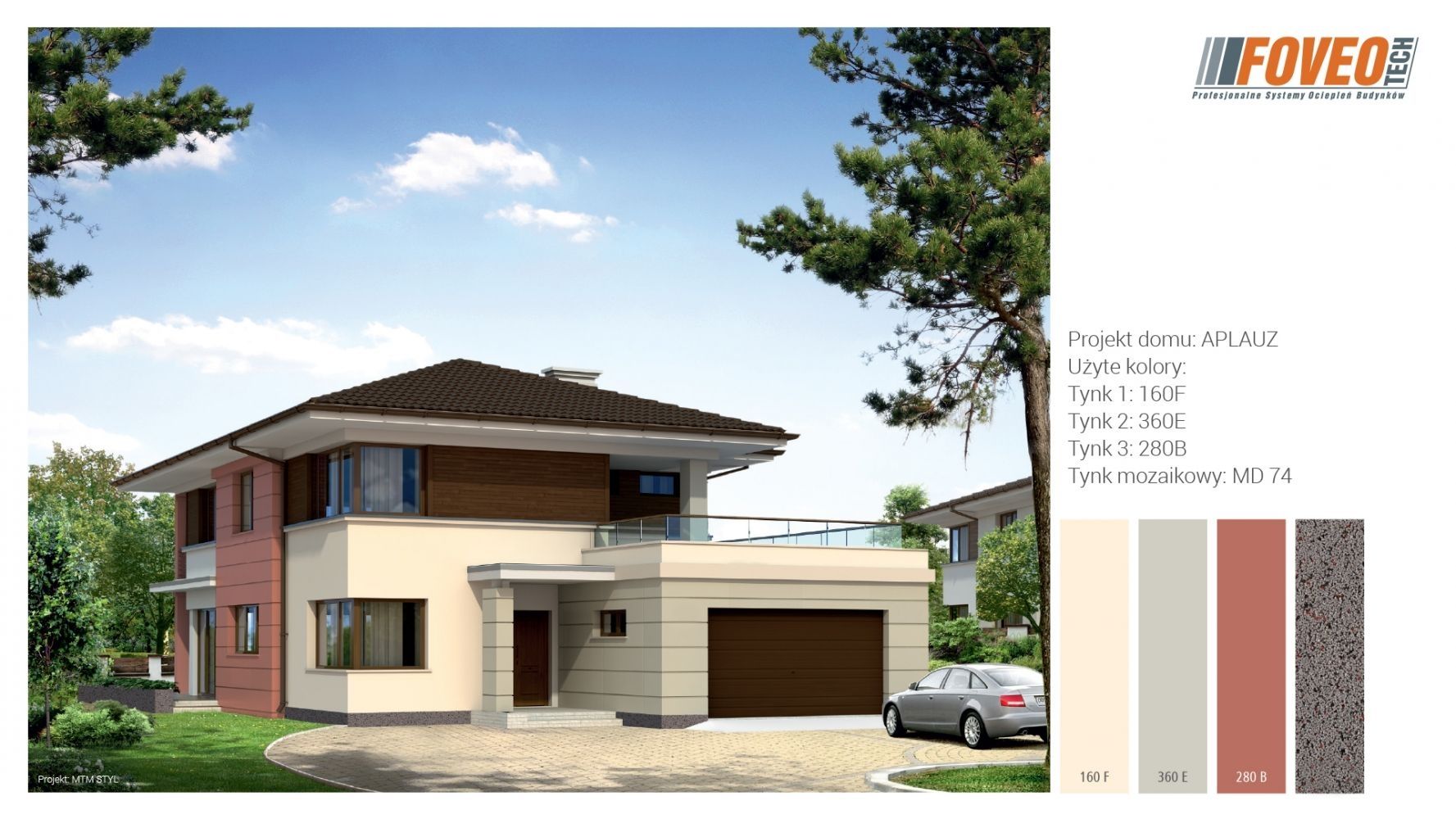
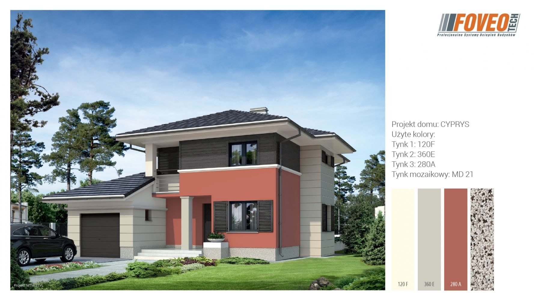
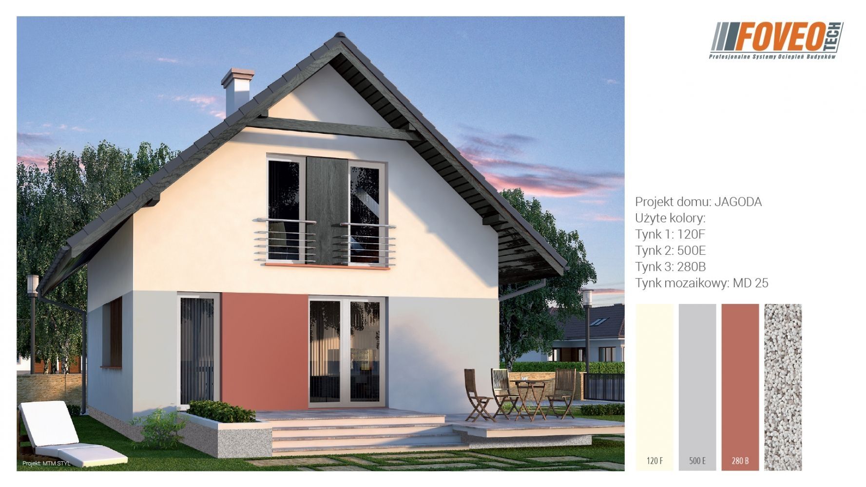
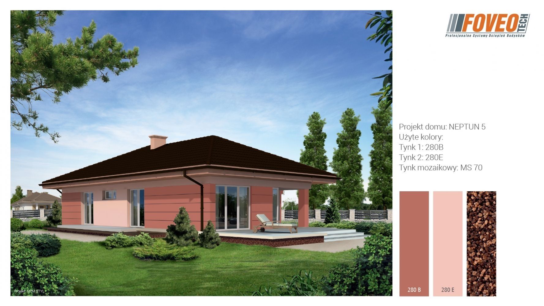
Red in nature is often found as colour of flowers and ripe fruit. It also reflects colour of many minerals. It is a shade which has been used for tinting for years, therefore it also holds a wide range of symbols. As a colour for walls red can be found mainly in the colour of bricks and clinker. As a colour for plaster usually light shades or red are preferable like pink, dark ones are not so popular but can be used when mixed with some yellow rather than violet admixture. On facades saturated red is primarily used as a colour of accessories - however, there are examples of this colour on large surfaces of walls. Red is also a very common colour for roofs in Europe, which is associated with a spread of ceramic tiles in this colour. Red colour, particularly saturated, reduces the space, comes out and zooms. Due to its complementary contrast with green, this colour brings a strong accent to the landscape, though it is less readable than white and yellow, as in the evening it darkens more quickly, according to the Purkinje effect. Pale and bright pink have different effects than saturated, dark red. Yet in European architecture pink colour is rarely used for facades - more often it is very bright pink with medium saturation.
Author: Justyna-Tarajko Kowalska
Gallery: