Colour in design - colour selection
COLOUR SELECTION
A building is perceived as a kind of three-dimensional image. Walls and roofs of architectural buildings create in this image colour planes, whose colour composition can be harmonious or chaotic, depending on their size, shape and orientation in space. While selecting a specific set of colours for an architectural building various factors are taken into consideration such as: the region’ colour and climate, surroundings and neighbouring buildings, investment’s size and type, facility’s function, its style, shape, scale, material, which it was made of and a role the colour is to make, economic considerations - time and funds allocated for the investement, as well as private taste of the investor and the designer, and prevailing colour fashion. The positive reception of a given composition of colours in architecture will also be influenced by observer's knowledge, their colour preferences, and the habits that depend on the cultural background and traditions of the region.
- CLIMATE AND COLOUR OF THE REGION - “area colour”, i.e. regional colour, depends on many factors like differences in vegetation, the colour of the earth and sky, locally available construction materials, traditions and cultural background. It is closely associated with the climate. For example, clean, bright colours look good in the hot sun, whereas in temperate climate they would be too bold. Studies show that in regions or cultures where specific colours were selected for a given type of a building, it is very likely that they will still be continued.
- LOCATION - studies show that positive relationship between the colour of a building and its surroundings is greater than the colour itself; colour should fit into the environment in such a way that it does not become unreadable and, on the other hand, not to be too aggressive, which can be read as bad and ill-considered colour selection. Colours of buildings locates in dense urban areas should be selected with taking into consideration the combinations used in neighbouring facades, and buildings located in open landscape should harmonise with the colours of the area and the region.
- STYLE - a decisive factor on positive reception of the colour composition of an architectural building is also its "suitability" to a particualr architectural style. A colour combination used for one building type can be negatively received in case of other and diffrent style. For traditional buildings it’s better to select delicate and pastel colours, using a monochrome composition with various brightness and/or saturation of colours. On the other hand, for modern house, based on simple geometric shapes, colours might be more contrasting and dynamic. Another issue are historic buildings, where colours should be based on historical sources.
- FORM - colour may make the formal expression of a building more attractive or dull. It can unify particular parts of the building by making it optical as one building block or divide it into sections in accordance with or contrary to formal and structural divisions. With an appropriate set of colours we can lower optically the building or hide some of its elements.
- MATERIAL - an architectural colour is closely related to material. Intense colours gain peculiar glow on smooth, glossy surfaces - like enamels, coloured glass, glazed tiles, clinker and plastics. In contrast, matt, coarse or fibrous textures such as plasters, raw bricks, concrete, coarse stone, harmonize better with less saturated colours - similar to shades found in nature.
- BUILDING’S FUNCTION AND ITS PARTS- it can be said that in certain buildings certain colour combinations seem to be appropriate - they correspond to the function and form of the building or its part. There is a different set of colours for single-family and multi-family housing, another for public buildings, another for cultural facilities, and yet another for representative buildings. Also, individual elements of the building, such as facade, roof or windows and doors, have a limited range of colours.
- COLOUR PREFERENCES - as studies and observations show, in Poland colours for facades of family houses are those reflecting natural materials - gray is associated with stones, yellow and brown refer to wood, red and orange are derived from clay. The least picked colours are those which are rare in nature - shades from green and blue to blue and violet.
In the event of roofs, dark and matt colours are preferable - most often in shades of red and brown, which is in line with the many years tradition of using ceramic roof tiles in numerous regions of Poland and Europe. In regions where shingle was historically predominant (e.g. in mountain areas),currently shades of dark gray and even black are preferred. In case of green and blue roofs there is no tradition in our country, therefore these colours are seldom chosen.
COLOUR ELEMENTS OF A BUILDING

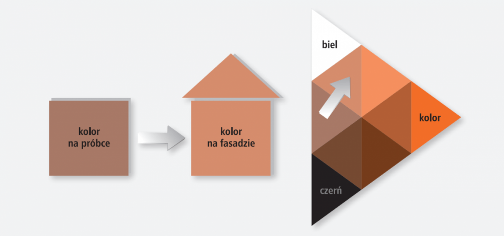
A building facade, especialy the front one, is some sort of a “business card”. It is therefore the most important element of shaping the building's colour. In addition to aesthetic qualities, the value of the facade is also determined by its funcionality. Today, not only are facade materials required to feature colour durability but also resistance to mechanical damage, precipitation, biological corrosion, air pollution, etc. Contemporary, facade paints and plasters are indispensable means of facade forming. Not only do they ensure protection against harmful effects of weather factors - primalry temperature, light and moisture, but also due to the various textures and a wide range of colours, they ensure great possibilities of arranging its appearance. Generally, two to three colours are chosen for facade, of which one colour is predominant for the larger part of the facade, and the other is supplementary. As a dominant colour, it is best to choose bright and pastel colour that will be easier to harmonize with the rest of the building and the surroundings, especially in open landscape and suburban areas. Warm, bright and saturated colours are more eye-catching and better perceived. Bright facade colours provide additional protection of buildings from overheating, visually giving the impression of cleanliness and coolness, and in practice, reflecting light, creating a natural barrier between the heated air and the interior of the building. Dark, saturated colours of plasters are not recommended in our climate in the area of more than 10% of the facade surface, due to increased absorption of sunlight, which causes the formation of unfavorable thermal stresses in the insulation layers. Before making the final choice on colour, it is worthwhile to paint a section of the facade with the selected shade, so as to assess the final visual effect. Generally, the selected colour looks brighter on the facade than on a sample, whereas bright colours become more white and dark ones more saturated.

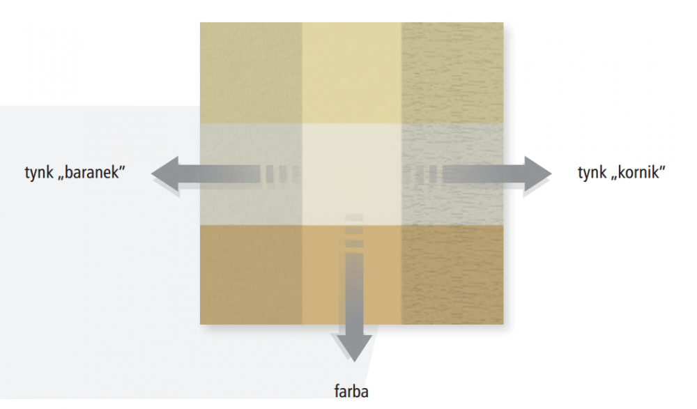
The colour is also influenced by the plaster texture - generally the larger the grain, the darker the colour will be.

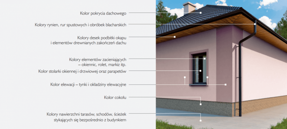
The facade colour is also influnced by other elements of the building. First of all, roof, which is made during the initial phase of construction, often determines the subsequent choice of colors. For example, it’s difficult to choose cold colours for a classical brick and red roof. Also, green or blue roofs reduce the number of harmonizing shades for walls. The greatest options of different, even contrasting combinations, are provided by graphite, black or gray roofs. The colour of gutters, drain pipes and flashings should also be adjusted to the roof colour. In addition to the perfect match of shades, gutters one shade darker than the roof colour can look well (e.g. brown gutters vs. brick red) or completely contrasting (e.g. white gutters vs. dark roof). The roof eaves and wooden roof ends is the contact surface between the roof and the facade, therefore their colour needs to be harmonized with the both elements. This is possible thanks to a wide range of colour preservatives, wood varnishes and stains, which also provide additional protection. Also, the colour of windows and doors should be selected with bearing in mind the future colour of the facade. There are often shading elements on the facade such shutters, blinds and awnings, etc. Their colours can be both uniform with the colour of facade, windows and doors, and very contrasting, which can contribute to a compelling decorative accent.
Often on facades are also applied various types of cladding made of porous materials (e.g. clinker, brick, stone, wood) or smooth facade boards. In this case it is worth limiting a set of colours of plasters or paints to one, maximum two shades, which harmonize with the colour of the cladding used. For practical reasons, a darker colour is selected for the plinth than the facade colour, which emphasizes the shape of the building. On the other hand, a bright plinth with a dark facade will contribute to an impression as if the building was above the ground and was a very light block. As the plinth is exposed to misture impact by contact with the ground, it’s recommended to use special materials for it, such as, for example, mosaic plasters or stone cladding. A visual fulfilment of the building colour composition are also colours of terraces, stairs, paths and driveways, which have a direct contact with the building.
Depending on the colour combination and materials used, we can distingush several types of architectural colour compositions:
- NATURAL COLOUR SCHEME
- elegant and warm colours, based primarly on colours of natural materials such as wood, brick and stone, complemented with plasters in various colour shades - mainly warm colours, mostly of low or medium saturation, generally from the group of yellow and orange. This colour type is almost always received positively, due to the strong links with the site’s traditions and the visual integration with the landscape.
- HARMONIOUS COLOUR SCHEME
- subdued colours, where bright, pastel colours are predominant for walls - white colours, including gray shades, and for roofs dark shades of red, black, gray and brown. Windows strips often appear in this colour type, in contrasting shades to colours of the facade, including sometimes shutters. A peculiar subtype are: achromatic colour scheme - based on white, gray and black colours. Currently, it is a popular colour combination, especially for service and office buildings.
- CONTRASTING COLOUR SCHEME
- colours, where highly saturated colours are selected for walls of the building, distinguishing it in the environment. There are two types of colours: dynamic colour scheme (expressive) - an integral part of the architectural concept, which generates strong emotional feelings - mostly positive and creates an interesting colour accent in space. A set of colours here is often integrated with the form and the architectural divisions of the building. An attention to detail is very characteristic here, whose colour often plays a major role in the reception of the whole. Bright colour scheme - is created by unprofessional colour selection, while at the same time a desire to achieve a strong plastic effect. Negative emotions are triggered mainly by the lack of harmonization of colour shades among themselves or too much aggressiveness and intensity of colour combinations.
Over the centuries, an approach towards colour in architecture has changed many times In different periods of history, there were also different colour functions.
- Ancient civilizations - Egypt, India, and China colour was symbolic, connected with religion, mysticism and culture.
- Antique - Greece and Rome although the colour palette did not change, colour was applied with stricter rules - based on the planned composition taking into account the form and structure of the building.
- Medieval times colour was symbolic, mystical, practical and informative; its role was mostly to delight and reflect the power and splendour of God.
- Classicism - Renaissance mainly material colour, rejecting superimposed colour and deprivating it of all symbolic and emotional meanings.
- Baroque and Rokoko appearance of illusory painting.
- 19th century - secession colour revival, decorative and ornamental colour; activity of impressionists, groundbreaking colour theories in the world of science - Young (1803) and Goethe (1810); colour pigments.
- 20th century - 1920, expressionism, suprematism, neoplasticism mainly in Germany - activity of Bruno Taut and Ernest May; Bauhaus and De Stijl - white walls and clean colours of details
- 20th century - Modernism - White Architects, Le Corbusier
- 20th century - Postmodernism - rebirth of colour - attempts to restore its symbolic function
- Contemporary times - the beginning of the 21st century
- liberated colour, dependent on individual preferences of an architect - creator
- controlled colour (colour strategis and standards, safe shades, etc.)
- safe colour scheme - facilitating accident-free production lines, as well as explicit identification of particular elements
- virtual colour - media facades
Nowadays, architectural colour scheme is not a matter of ideology, but rather an individual choice of an architect-creator. There are no privileged or discarded colours and their combinations. Colour is now a space-shaping tool - a dynamic and variable element that belongs both to the space and structure of the building, being a link and at the same time a boundary between these elements.
Author: Justyna-Tarajko Kowalska
