Colour in design - colour functions and perception
Colour has always been in architecture. It is an integral part of both construction materials and light, which falls on these materials. It is present on flat surfaces and bodies, helps to organize space, strengthens the feeling of architectural choices. It is a recognizable sign and a basic communication medium. If colour did not exist, architecture would be deprived of the real dimension - not only because colour provides it with a positive aesthetic value but also due to its practical role: information, decoration and finally its strong impact on the human psyche.
COLOUR FUNCTIONS AND PERCEPTION
Colour in architecture is an important element influencing perception of the building, emphasizing the functional content and deciding on aesthetic qualities of the composition. The differences of the three basic colour parameters - shade, brightness and saturation - make it possible to distinguish and identify a particular element and its location in space.
COLOUR PARAMETERS AND THEIR CHARACTERISTICS
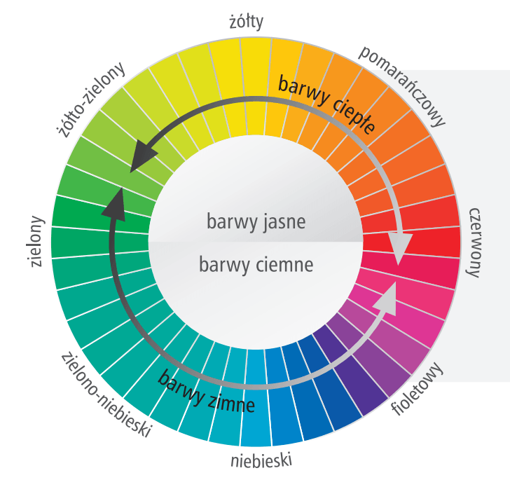
- Shade - the differences in perception of shades are the result of different wavelengths of visible light - from the longest waves of red to the shortest waves of violet. In the light spectrum, between red and violet, the shades of orange, yellow, green, and blue are also distinguishable. All colour gradations - from the most saturated to white, grey or black - have the same shade. Colour wheel contains a basic arrangement of spatial shades. There are eleven basic colour names in many languages of the world. These are chromatic colours: red, green, yellow, blue, brown, orange, pink and purple and achromatic: white, black and grey.
- Brightness - defined in the range 0 (black) - 100 (white) means the amount of light reflected from the surface of a particular colour compared to the amount of light reflected from the white surface. Different shades have so-called own brightness - yellow is the brightest colour, red and green feature average brightness, whereas blue and lowest brightness. Brightness is subject to change when source, direction and distance from the light changes, and each colour may appear lighter or darker depending on the environment.
- Saturation - intensity, chromaticity determines the position of a particular colour shade between the pole of pure colour with maximum saturation and grey. Highly saturated colours are strong, intense, attract attention; lowly saturated colours are close to grey and have a neutral character.
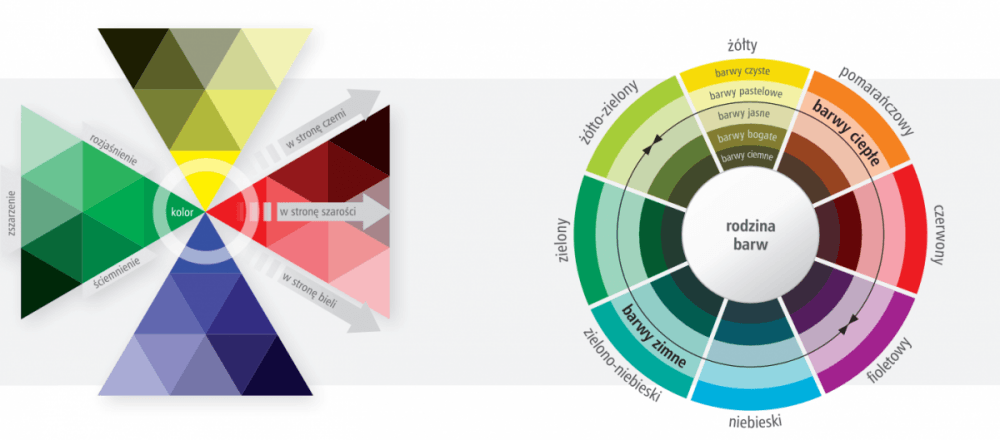
COLOUR FAMILIES
- Clean colours - highly saturated and bright colours corresponding to so called own shade, since these colours attract attention the most, they are reserved mostly for relatively small areas
- Pastel colours - highly saturated bright colours, often chosen for facades
- Bright colour - lowly saturated bright colours, tone-down colours, often chosen for facades
- Dark colours - dark colours of medium or low saturation
- Rich colours - dark colours of high saturation
Colour also significantly influences the sensory evaluation of a particular composition - both in a positive and a negative sense. The role of colour, as an equivalent form of expression, is to reinforce and complement the form of a building by articulating various elements of its structure. Differentiated colour scheme allows to enhance the form, emphasizing its rhythm and divisions, highlighting important compositional elements, optical linking or division of structures, and even visual change of proportions. Colour can also appear as an ornament or a pattern decorating the facade. The building colouring should, in addition to functional and aesthetics roles, emanate certain emotional feelings. Its aim is to draw attention to specific elements of the construction or decoration, as well as to provide appropriate mental stimuli - especially those that will generate good mood and aesthetic satisfaction.
COLOUR FUNCTIONS IN ARCHITECTURE
- Utilitarian (functional-utility) - colour codes - colour standards, orientation in space, information, protection against weather conditions.
- Decorative - aesthetic, decorative colour, superimposed, ornamentation, pattern, building mood, psychic effect.
- Accent or camouflage - highlighting / hiding, emphasising / masking
- Symbolic - cultural traditions, religious and historical relationships
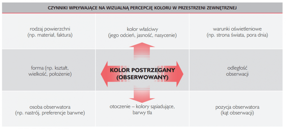
Colour in architecture is of a material nature and depends on the form and the background. Its perception in space depends on the element it was placed (e.g. facade, roof, window frame, cornice), surface texture, its position and size, light and environment. The final colour effect in the external environment depends on many factors - colour itself, neighbouring colours, background colour, light source and observer.
COLOUR IN ARCHITECTURE
- natural colour such as stone, wood, clay and ceramic (e.g. brick), metals, colours of artificial materials such as plastics, glass.
- pigmented, applied colour - facade paints and plasters.
- light colour - media facades - colourful facade lighting mainly based on RGB led.
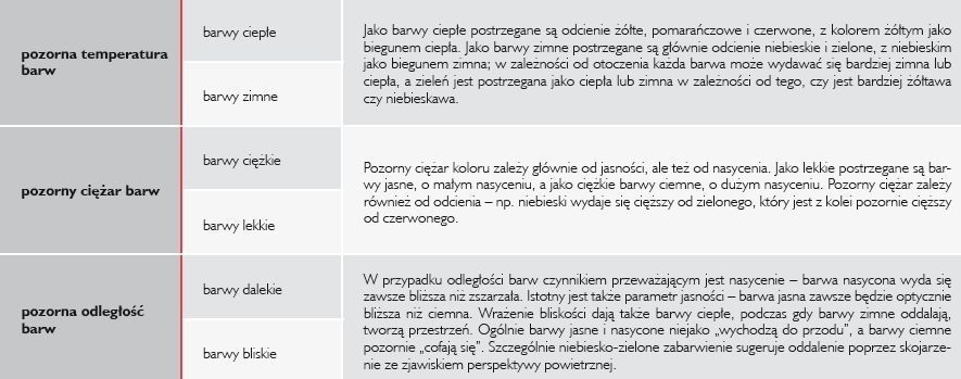
Despite individual differences in colour perception, there are some general reactions common to all people. Colours may seemingly zoom in or out, spread or focus, give the impression of cold or warm. They can seem light or heavy, and thus seemingly cheer up or overwhelm. This gives us an opportunity to consciously use these optical effects while choosing colours.
APPARENT COLOUR IMPACT ON HUMAN
Author: Justyna-Tarajko Kowalska
Gallery:
