Colour in design - colour composition
COLOUR COMPOSITION
Colour comes in a variety of interactions with the background it is displayed on and can be harmonious or contrasting. Differences in visual colour perception against the background are combined with at least one of the elements: shade, brightness or saturation, and contrast can be of a chromatic or achromatic nature.
In natural environment, there are often simultaneous contrasts of all the three colour parameters. Such contrast is called "natural contrast" or "triple contrast". In an architectural design the triple contrast is used relatively rarely. In general, a simple - one-element contrast is used, where only one of the colour parameters is subject to change (shade, brightness or saturation) or binary - double, where two arbitrary colour parameters are subject to change. In order to achieve the most effective contrast, the contrasting elements should occupy a relatively small surface area. Depending on the spatial relationships between the shadows in the colour wheel and the different saturation and brightness parameters, the following types of colour compositions can be distinguished:
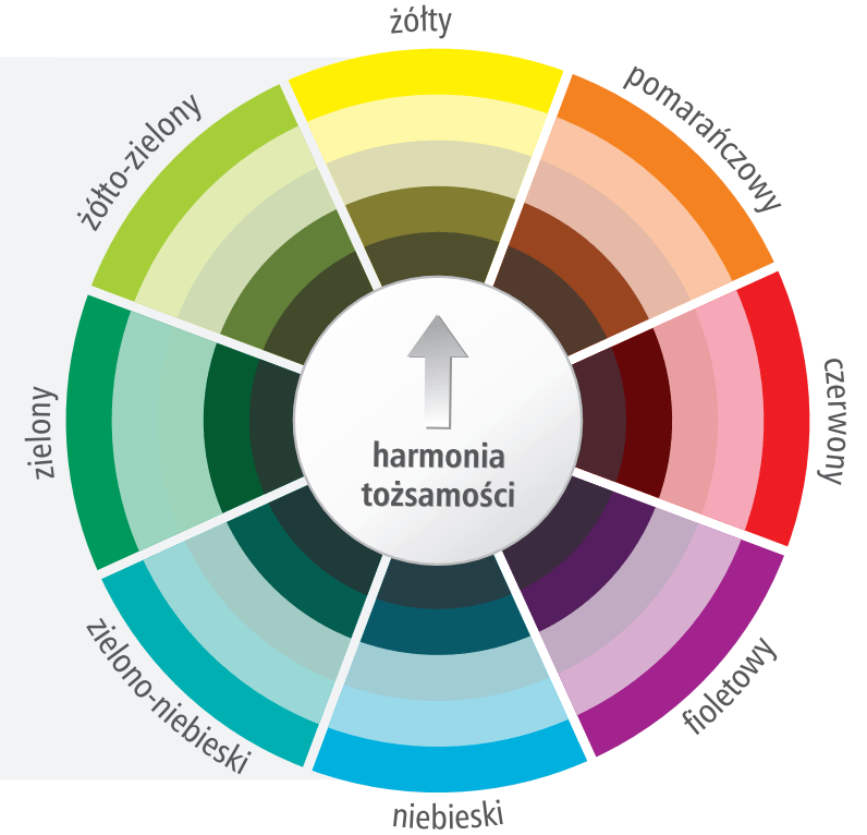
MONOCHROMATIC COMPOSITION, SO CALLED IDENTITY HARMONY
- it’s a colour combination built on a single shade of colour in which the brightness and / or saturation are varied. This type usually provides a harmonious effect - it can only be more dynamic or delicate, depending on the magnitude of the difference in brightness and / or saturation between individual colours.
- brightness differentiation - this composition is in principle harmonious and in the case of facade usually produces the best results. The darkest colour is most often chosen for plinths, which, due to the apparent weight, gives the impression of a solid foundation. Decorative elements such as rustication or strips around windows and doors are usually slightly lighter or darker than the facade colour, depending on the desired effect;
- saturation differentiation - a composition based on combination of more vivid colours and grey shades or even of total grey; due to the strong influence of saturated colours, it is better to reserve them for smaller areas;
- brightness and saturation differentiation - a composition, where two parameters of a particular colour shade are subject to change.

ANALOGICAL COMPOSITION, SO CALLED HARMONY THROUGH ANALOGY
- a colour combination based on combination of colour shades located on the colour wheel in its immediate vicinity. When combining two or three related shades, brightness and / or saturation can also be differentiated. In this composition type we can create warm colour schemes by combining shades close to the heat pole - yellow, or cold colour schemes based on blue - colour from the cold pole areas.
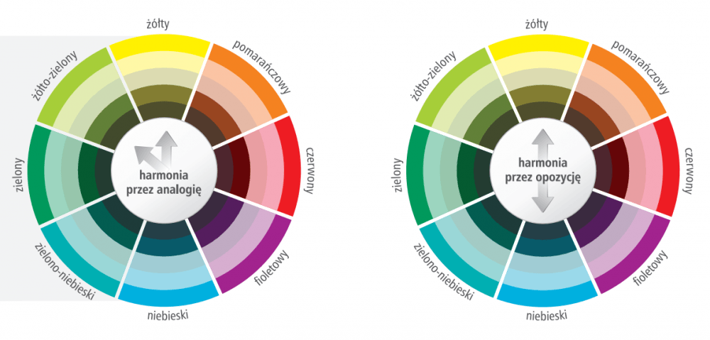
COMPLEMENTARY COMPOSITION, SO CALLED HARMONY THROUGH OPOSITION
- the most contrasting colour combination based on combining shades being at the opposite poles in the colour wheel. Yellow and violet, red and green, orange and blue are considered to be the strongest opposition pairs. In this composition type, due to high contrast of the shade, it is also important to make a difference in brightness or saturation of the selected colour scheme. But it’s worth bearing in mind that change of all the three parameters may contribute to impression of disharmony and chaos.
NEUTRAL COMPOSITION
- a colour combination formed by combining lowly saturated colours with white, black or grey. Obviously, the biggest contrast is obtained by combining black and white.
Author: Justyna-Tarajko Kowalska
Gallery: